


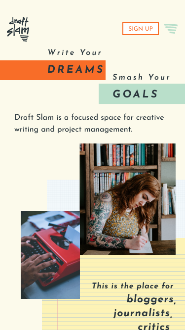
CASE STUDY
Draft Slam
a cloud-based app for creative writers

PROBLEM
There aren’t many cloud-based storage apps designed specifically for the needs of creative writers and professionals.
SOLUTION
Draft Slam is cloud-storage created with writers in mind. The interface mimics writing paper, the templates are based on creative writing prompts, and it functions like an easy to use notebook. There is a place for writers to track their goals.
MY ROLES
- user research
- information architecture
- wireframe sketches
- digital wireframes
- usability testing
- brand characteristics
- Figma and inVision mockups
Discovery & Research
USER RESEARCH FINDINGS
What do you wish about cloud storage apps?


integrated with each other

had less apps that did more

did one thing well
What will cloud storage help you achieve in the next year?

more organization

use less paper

grow my business
USER SURVEY PARTICIPANTS
- college degree +
- women between 27-35
- from Philadelphia
MOST USED APPS
- Google Drive
- Dropbox
COMPETITIVE ANALYSIS FINDINGS
- There is need for a writing app with collaboration and a template library.
- Appeal to all writers / use all device platforms to reach a wider audience.
- Simplicity in design and layout with less screens and concise directions.
USER PERSONAS
I considered creative writers who balance side projects with their main employment, and enjoy collaboration. My focus was personas working in theater and visual arts.
Fallon
"I'd love my work to be published on Hyperallergic."

- age: 27
- gender: female
- location: philly, pa
- user: task-oriented
- tech use: high
- occupation: museum curator
GOALS
- organize documents
- apply to creative opportunities
- reduce paper and clutter
FRUSTRATIONS
- lack of integration among apps
- open individual files to see the content
- edits from collaborators aren’t visible
MOTIVATIONS
- track edits, goals, and progress
- needs app integration
- apply to writing opportunities
Dan
"I've challenged myself to write 2,000 sketches in 2 years."
- age: 35
- gender: male
- location: ny, ny
- user: creation-oriented
- tech use: high
- occupation: scriptwriter
GOALS
- focus more time on writing
- work with a partner to generate ideas
- stay on track with current projects
FRUSTRATIONS
- apps aren't robust
- complicated navigation
- too many app options
MOTIVATIONS
- store writing, ideas, and inspiration
- desires focused work spaces
- sharing capabilities
Information Architecture
USER STORIES
Based on the competitive analysis and user’s needs, these 10 user stories were generated for the minimum viable product.
| ROLE | TASK | IMPORTANCE |
|---|---|---|
| As a returning user | Create content | High |
| As a returning user | Save content | High |
| As a returning user | Upload files | High |
| As a returning user | Organize content | Medium |
| As a returning user | Share item/folder | Medium |
| As a returning user | Track a goal | Medium |
| As a returning user | Delete content | Low |
| As a returning user | Find content | Low |
| As a returning user | Connect with users | Low |
| As a returning user | View menu | Low |
| As a returning user | Contact customer service | Low |
| As a returning user | Edit profile | Low |
USER FLOWS
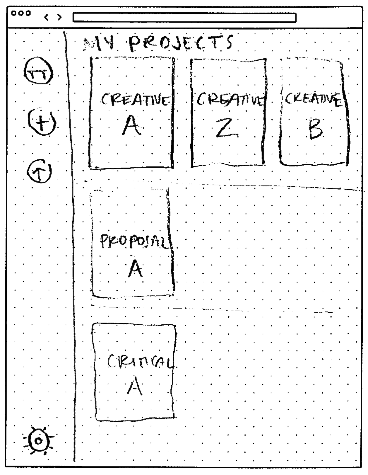
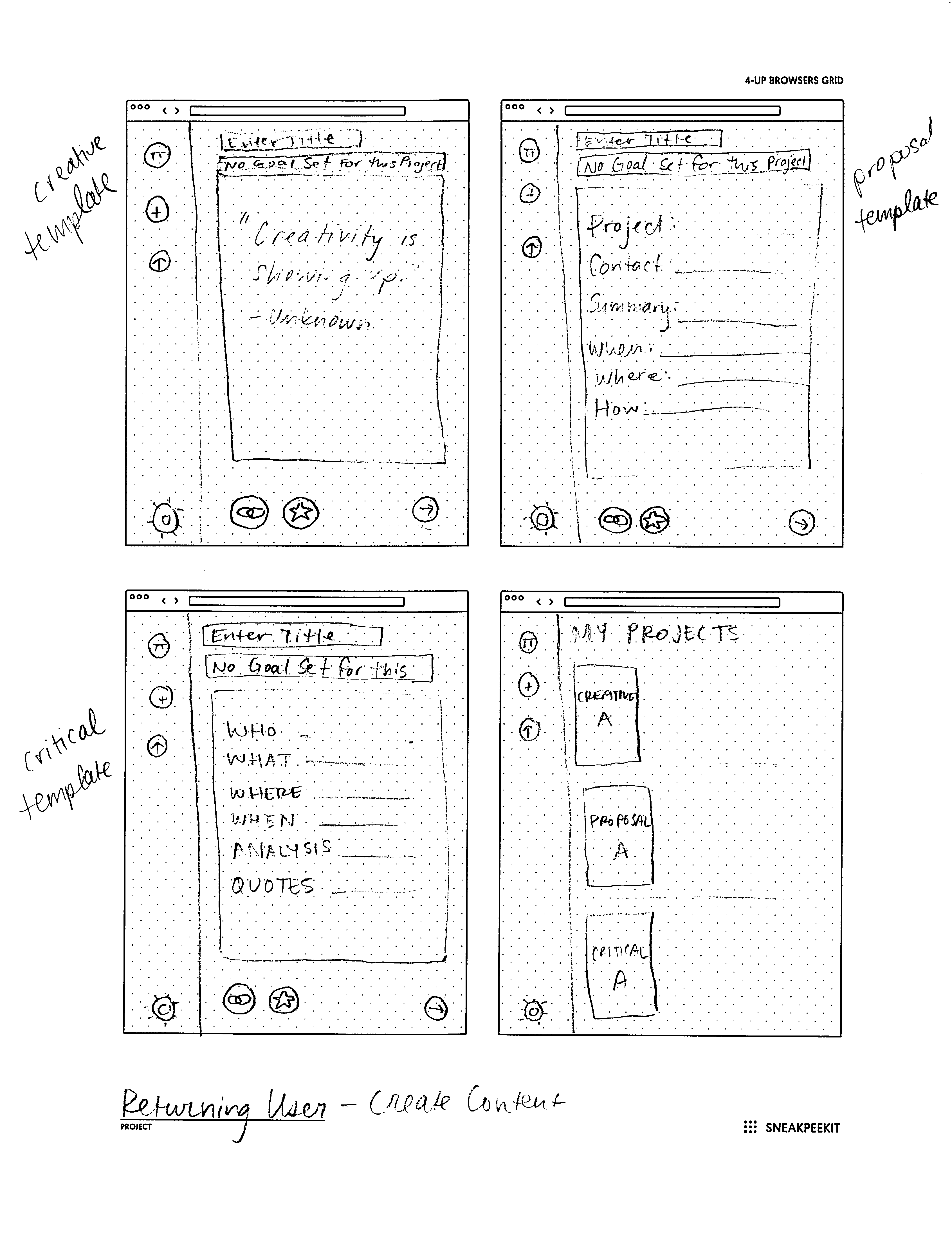
User Flows for Draft Slam followed the highest priority user stories. Flows were created for new users to create an account and view shared content. Returning user flows include creating, organizing, saving and uploading content.
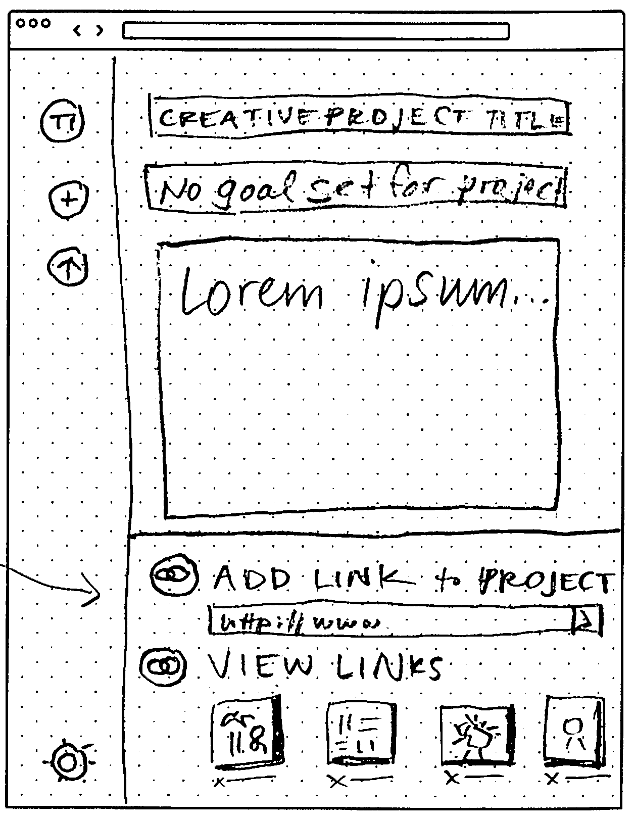
The story shown here is what makes DraftSlam unique. When starting a new project, writers have the option to choose a template or create their own. This flow is meant to be easy to use so that users can spend more time creating.

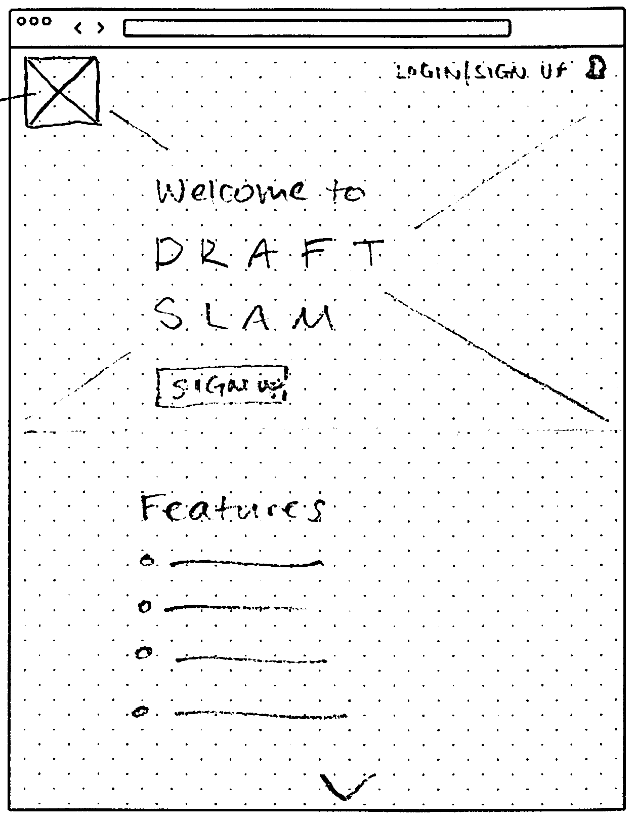
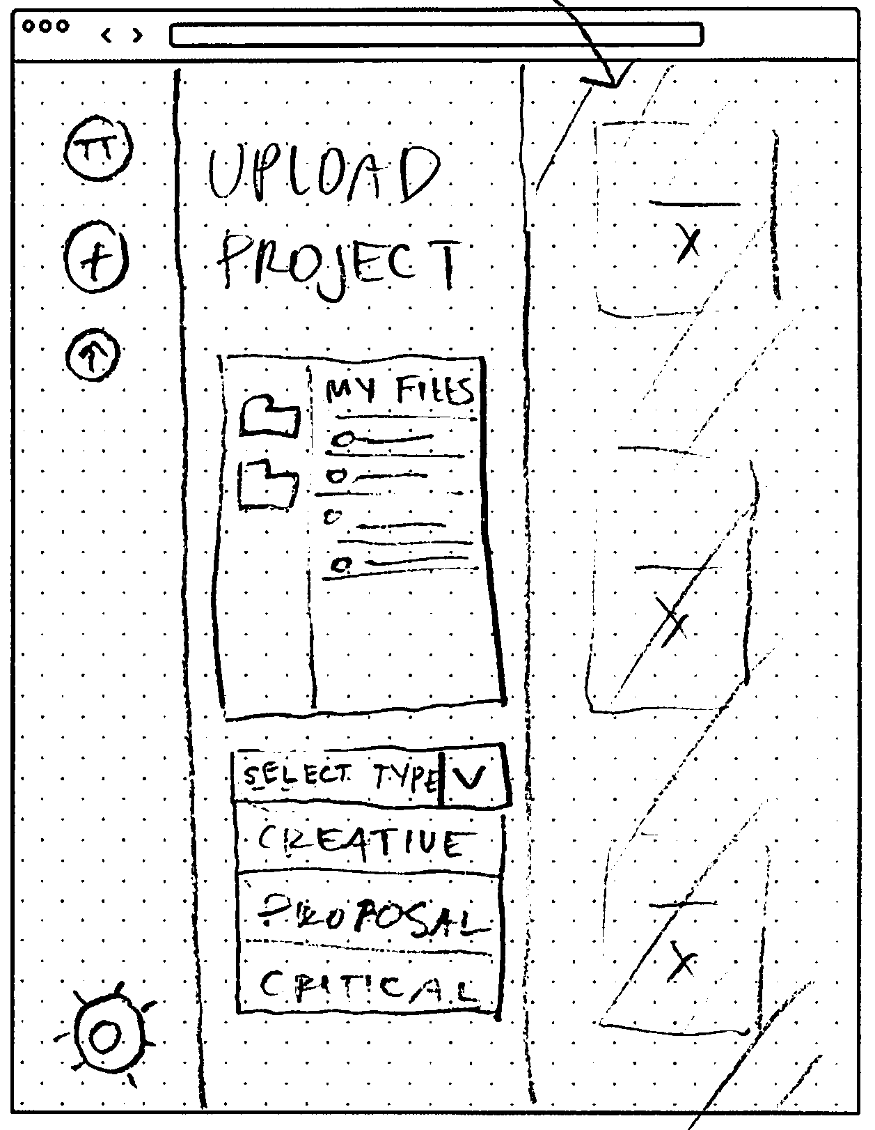
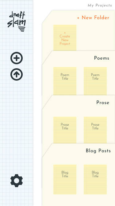
WIREFRAMES
When creating wireframes I kept the idea of simplicity in mind. I decided to incorporate overlays and drawers into the application to simplify the screens when using them to create content.
Usability Testing
TASKS
- Create new account
- Add content
- Organize content
IMPRESSIONS
- positive reaction to design
- unsure of the purpose of the site
- completed first two tasks without errors
- last task revealed some problem areas
- wanted templates + folders to be editable
CHANGES MADE
- rework content strategy
- about paragraph needs more detail
- remove upload button at the bottom
- gear icon is confusing
BRAND CHARACTERISTICS
Someone who’s using this app for administrative tasks needs this app to be organized, clear, and direct. A creative project user needs this app to have a fun, playful feel with easy collaboration views. Overall the app should feel fun, organized, and helpful.

COLOR PALETTE
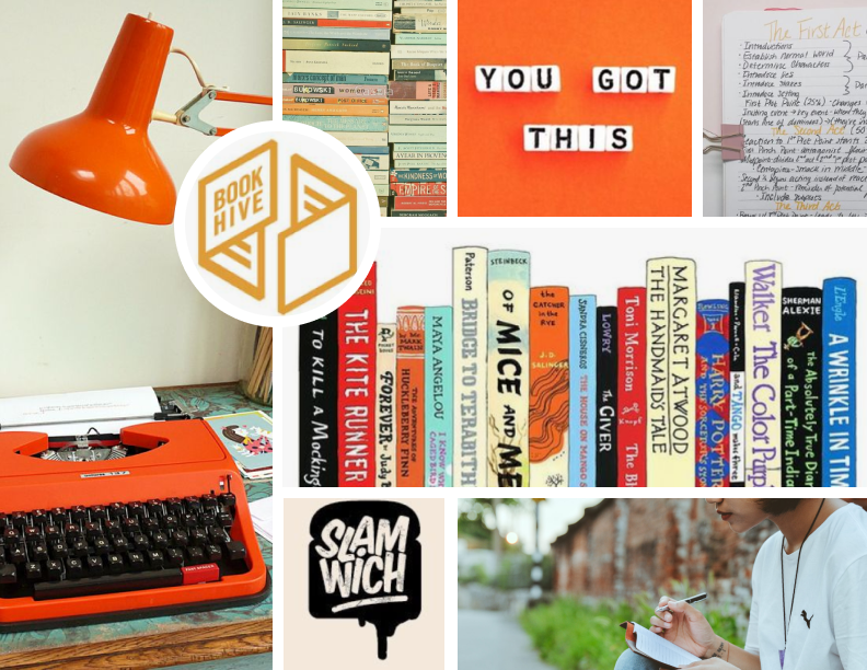
The color palette is inspired by the colors on a legal pad, ink, and a basketball. These bright colors support the brand’s fun feel, while also reminding the user of the writing they do by hand.

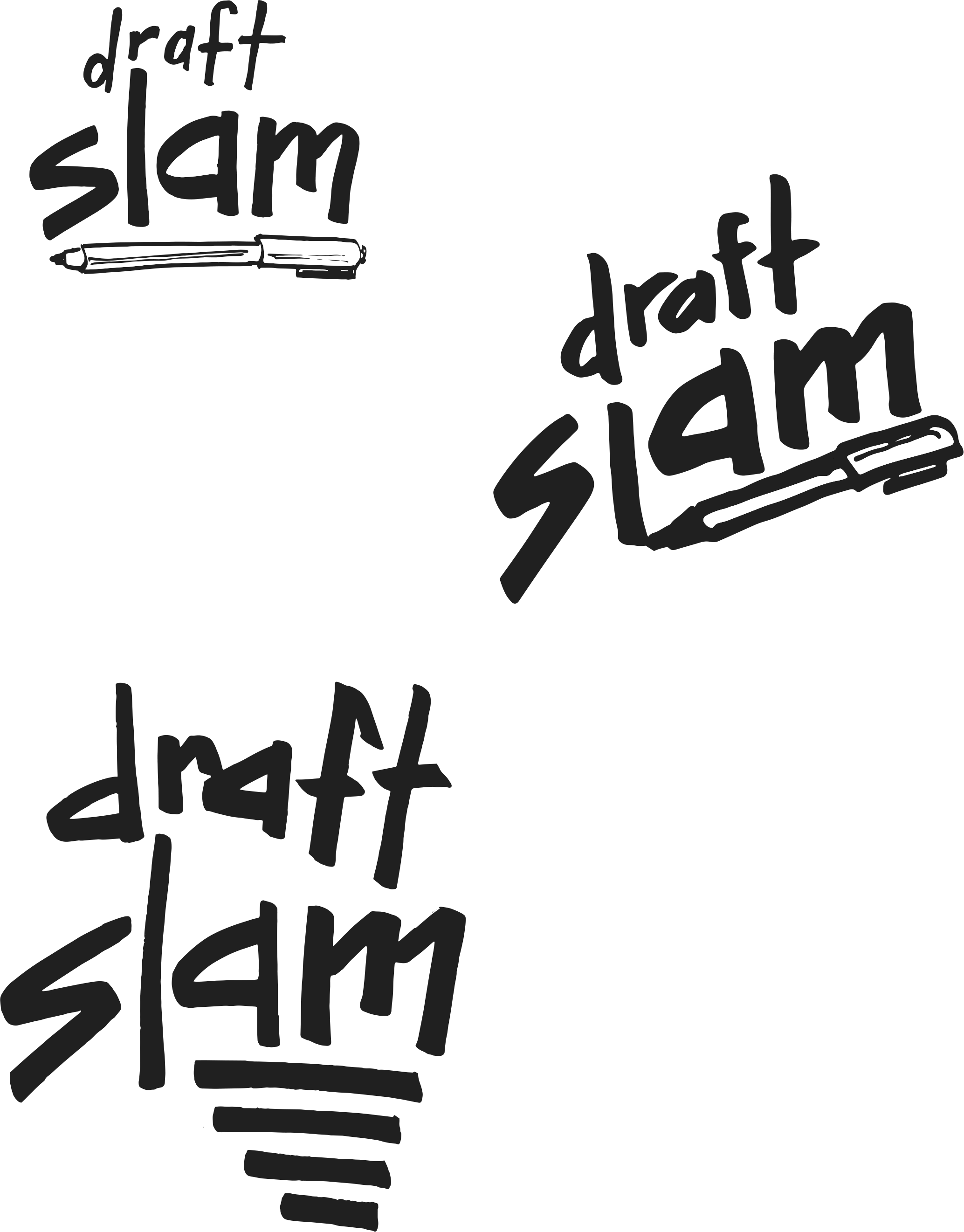
TYPOGRAPHY
The Draft Slam logotype is unique to its logo. It shows that the brand is creative, helpful, and active. Josefin Sans has a clean, neutral, and friendly appearance that pairs well with the custom logo typeface.

LOGO + DESIGN PROCESS
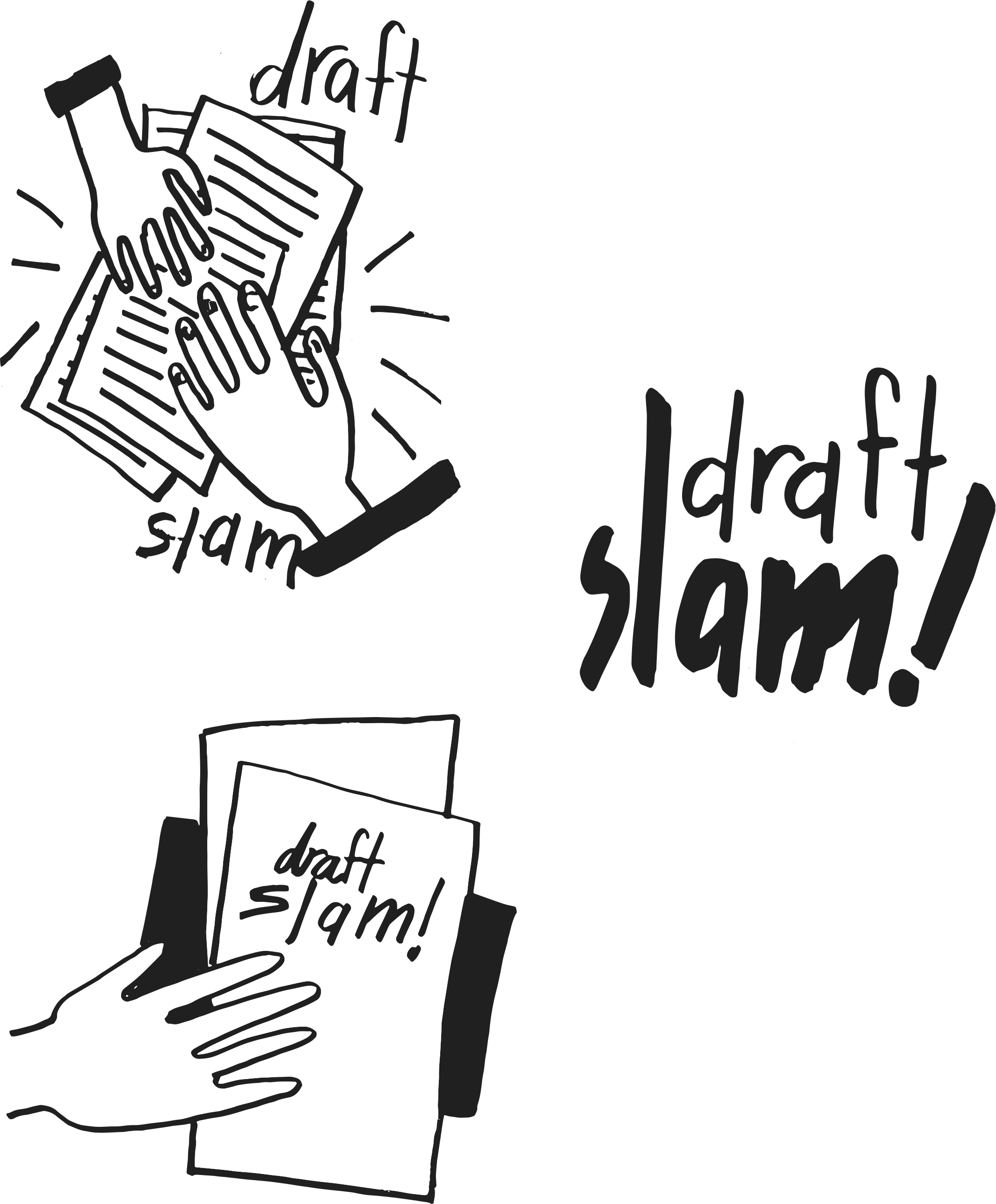
After looking at all of my designs and ideas, I arrived at Draft Slam as the name of my app. It conjures fun images that communicate the collaborative nature of the application.
The imagery of a slam dunk comes to mind to let the user know they will be achieving their goals with this app. The logo ideas I sketched are inspired by sports, basketball, and documents. These feel whimsical, simple, and brightly colored.
HIFI MOCKUPS
Overall when designing I kept simplicity in mind and wanted to feature the grid and legal paper backgrounds.
Usability + Preference Testing
TASKS
- Login to account
- Add content
- Organize content
IMPRESSIONS
- struggled to login on mobile app
- confusing prototype
- preferred a bold dashboard
CHANGES MADE
- redesign hamburger icon
- add login button to mobile home
- moved upload to project drawer
- changed “My Project” to dark blue

CONCLUSION
Sticking with simplicity worked well for this project. Some of the biggest design flaws were restricting the user’s ability to customize their dashboard, vague content, and vague prototypes.
The biggest insight I gained from this project was how to write surveys for the problem and to avoid scope creep.