CASE STUDY
Careshare
a desktop app for users to start sitting cooperatives with their friends


PROBLEM
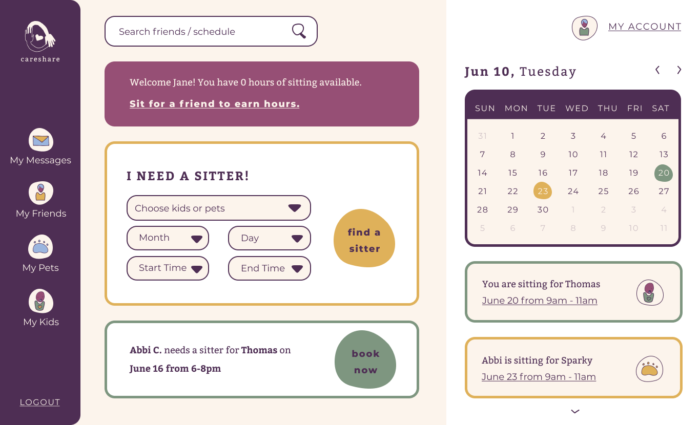
Traditional child-care (and pet-sitting) is expensive, and lacks the community so many parents seek. Careshare allows parents to start care cooperatives with their friends and neighbors to reduce the cost of care, and make tracking and trading time a seamless transaction.
SOLUTION
Careshare is a desktop app designed for parents and pet-owners to track their sitting hours and find sitters.
MY ROLES
- user research
- information architecture
- wireframe sketches
- digital wireframes
- usability testing
- brand characteristics
- Figma and inVision mockups
Discovery & Research
USER RESEARCH FINDINGS
How do you feel about scheduling childcare?
- I want easier ways to find and schedule reliable childcare.
- I find it easy and painless.
- I have to know my schedule well in advance in order for it to go smoothly.
Where do you look for childcare when you need to find someone?
- friends
USER SURVEY PARTICIPANTS
- parents to one or two toddlers
- work full time
- flexible work schedules
- prioritize community + emotional support
CURRENT CHILDCARE
- family
- daycare or school
COMPETITIVE ANALYSIS FINDINGS
- Offer a clear, easy to use, free alternative to other babysitting cooperative apps.
- Market to a large audience of parents and pet owners.
- Simplicity is important to design to save users time and stress when scheduling childcare.
USER PERSONAS
I considered creative writers who balance side projects with their main employment, and enjoy collaboration. My focus was personas working in theater and visual arts.
Kris
"I'll use anything to help simplify the logistics of parenting."

- age: 36
- gender: female
- occupation: small-business owner
- tier: occassional use
- role: date-night user
GOALS
- free childcare on date nights
- help out her friends
FRUSTRATIONS
- asking friends to babysit is awkward
- building trust and participation takes time
MOTIVATIONS
- cheaper date-nights with her partner
- supports cooperative businesses
- simple scheduling and planning
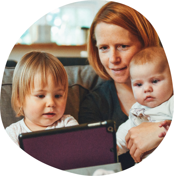
Cassie
"Co-operative babysitting is a fulfulling and affordable way to get childcare."
- age: 34
- gender: female
- occupation: stay-at-home parent
- tier: occassional use
- role: daytime-errand user
GOALS
- stick to a tight childcare budget
- take a break from her kids
FRUSTRATIONS
- anxious about leaving children with friends or family
MOTIVATIONS
- need to run errands in the day without children
- tight budget
- trusts her friends who use the app
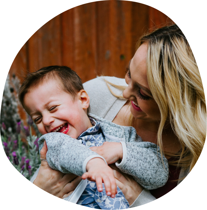
Allyson
"I find creative ways to use the resources I have."
- age: 30
- gender: female
- occupation: fine-dining server
- tier: consistent
- role: shift-work user
GOALS
- save $500 per month on childcare
- have a consistent schedule
FRUSTRATIONS
- unreliable family or friends
- need a better give-and-take
MOTIVATIONS
- cover her childcare while she works part-time
- consistency in scheduling
- save money
Information Architecture
USER STORIES
Based on the competitive analysis and user’s needs, these user stories were generated for the minimum viable product.
| ROLE | TASK | IMPORTANCE |
|---|---|---|
| As a returning user | Add availability | High |
| As a returning user | Schedule a babysitter | High |
| As a returning user | Add/find friends | High |
| As a returning user | Find a babysitter | Medium |
| As a returning user | Edit availibility | Medium |
| As a returning user | Track my babysitting hours | Medium |
| As a returning user | Message a friend | Medium |
| As a returning user | Update my payment info | Low |
| As a returning user | Find a pet sitter | Low |
| As a returning user | Connect with neighbors | Low |
| As a returning user | View menu | Low |
| As a returning user | Contact customer service | Low |
| As a returning user | Edit profile | Low |
USER FLOWS
User Flows for Careshare followed the highest priority user stories. Flows were created for new users to create an account. Returning user flows include viewing the calendar, adding or finding friends, creating an account, finding a babysitter, and scheduling a babysitting.
The story shown here is what makes Careshare unique: finding someone to babysit for them. This flow is meant to be easy to use so that users can schedule a sitter quickly and hassle-free.
WIREFRAMES
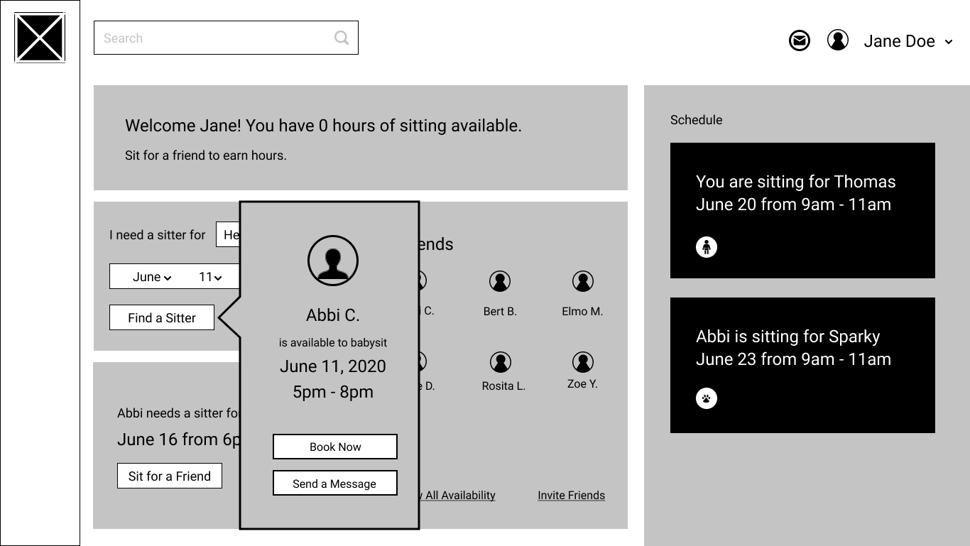
When creating wireframes I wanted to keep it as simple and easy to use as possible. I looked at dashboard UI inspiration and found some patterns to incorporate. At this point the animation was to have pop-ups when items on the dashboard were selected.
Usability Testing
TASKS
- Create new account
- Login to existing account
- View kids + pets
IMPRESSIONS
- trouble adding kids or pets
- couldn't find pending booking
- sit for a friend modal was confusing
- wanted more confirmation screens
CHANGES MADE
- revise schedule view in dashboard
- move profile and messages
- reposition sit for a friend box
- reorder icons on the left nav bar

BRAND CHARACTERISTICS
Someone who’s using this app for administrative tasks needs this app to be organized, clear, and direct. A creative project user needs this app to have a fun, playful feel with easy collaboration views. Overall the app should feel fun, organized, and helpful.
COLOR PALETTE
The color palette is inspired by the colors on a legal pad, ink, and a basketball. These bright colors support the brand’s fun feel, while also reminding the user of the writing they do by hand.
TYPOGRAPHY
The Draft Slam logotype is unique to its logo. It shows that the brand is creative, helpful, and active. Josefin Sans has a clean, neutral, and friendly appearance that pairs well with the custom logo typeface.

LOGO + DESIGN PROCESS
After looking at all of my designs and ideas, I arrived at Draft Slam as the name of my app. It conjures fun images that communicate the collaborative nature of the application.
The imagery of a slam dunk comes to mind to let the user know they will be achieving their goals with this app. The logo ideas I sketched are inspired by sports, basketball, and documents. These feel whimsical, simple, and brightly colored.
HIFI MOCKUPS
I went through two iterations of the design before testing, and one afterwards. My revisions included accessiblity, design patterns, hierarchy, and buttons.

Usability + Preference Testing
TASKS
- Login to account
- Add content
- Organize content
IMPRESSIONS
- struggled to login on mobile app
- confusing prototype
- preferred a bold dashboard
CHANGES MADE
- redesign hamburger icon
- add login button to mobile home
- moved upload to project drawer
- changed “My Project” to dark blue
CONCLUSION
Using sensible UI and design patterns worked well for this project, especially when designing the dashboard. Some of the biggest design flaws were the lack of a way to enter availability, the drawers, and the color/text accessibility.
I felt like this is a worthy cause, but that it might actually not launch well because it is too uncomfortable for the user to participate in.
I learned to find UI/UX inspiration before crafting the wireframes, and consider design patterns with more intention. I wanted to “do something different” but ignored well-worn design patterns that would aid the user and therefore would make this app easier for them to use. In the future I will be more intentional about my designs, and back them up with visual inspiration and research beforehand.